Rebranding Case Study: North Fulton Community Improvement District Becomes True North 400
Challenge
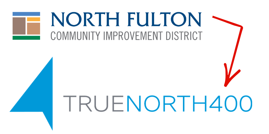
After 20 years, the North Fulton Community Improvement District (CID) felt it had limited name recognition and understanding by the community and key stakeholders of its accomplishments. Although it is a quasi-governmental, self-taxing entity formed by commercial property owners, people thought it was a government entity or a financial institution. With its 20th anniversary approaching, it was the perfect time for a full rebrand, including the name, logo, colors and messaging.
Solution
c21 conducted its comprehensive branding process by first gathering information from stakeholders. The agency interviewed organizational leaders, current and former board members and partners to identify the CID’s strengths, opportunities, weaknesses and threats. c21 reviewed past projects and marketing assets, which led to the creation of updated mission and vision statements along with refreshed organizational messaging. Our findings informed a creative brief that guided the name and brand development.
During the rebrand process, “True North” was suggested by a board member, however due to its common usage, c21 suggested adding "400" to establish a strong connection to the organization’s principles and its project portfolio along state route Georgia 400, including three cities within the district boundaries.
c21 then worked with a graphic designer known for creating high-profile logos, who created multiple mock-ups. c21 narrowed the options with the client and presented three final designs to the board with updated messaging. The selected design featured a modern arrow icon pointing north with three points representing the three cities within the CID – Alpharetta, Milton and Roswell. The logo completely revised the muted corporate colors of the past to new, bold brand colors that made a statement.
c21 created an official brand guide, website and digital marketing assets, including email marketing templates and social media designs. We launched the new brand and immediately began managing the organization’s digital marketing – from emails to social media to videos and more.
Results
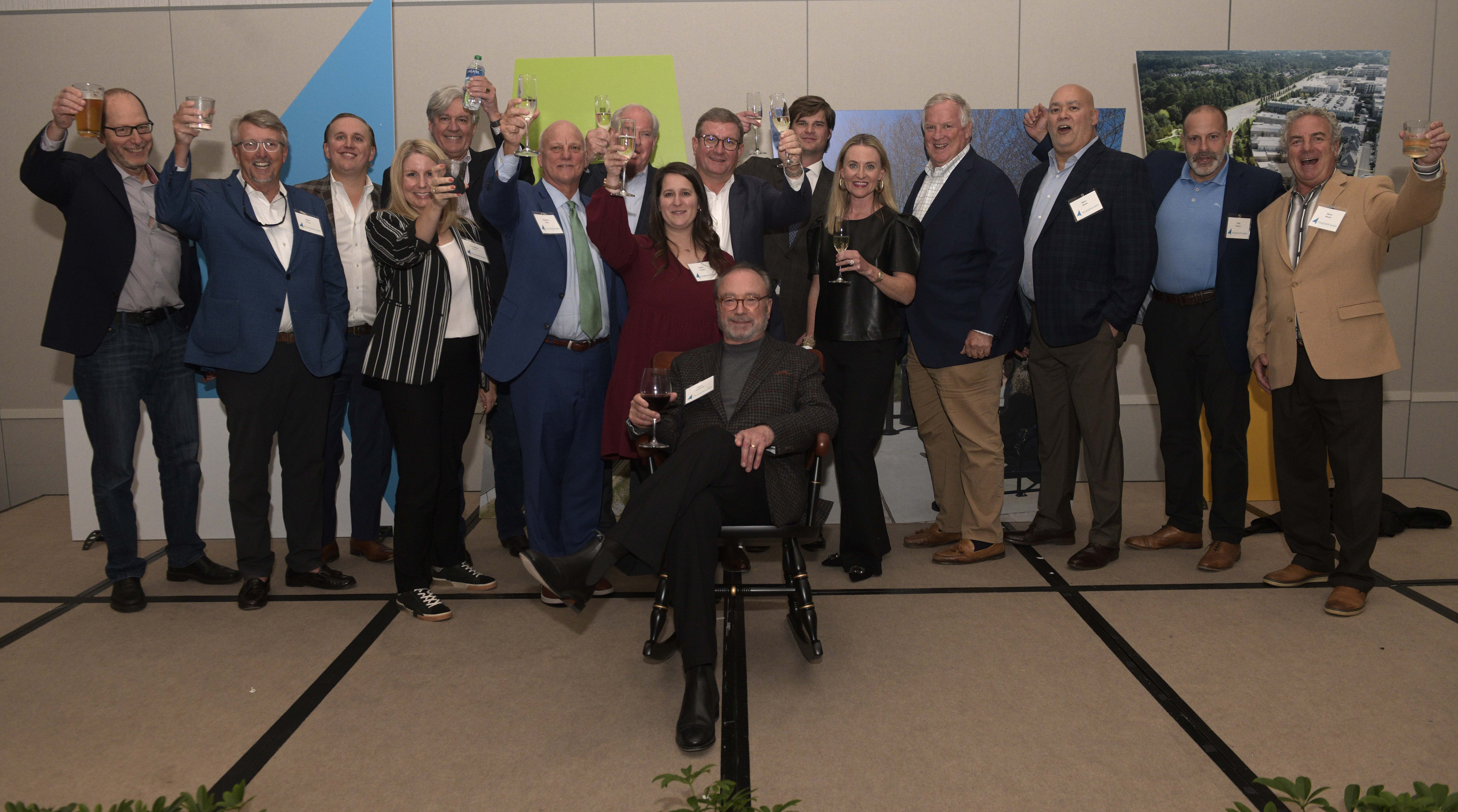
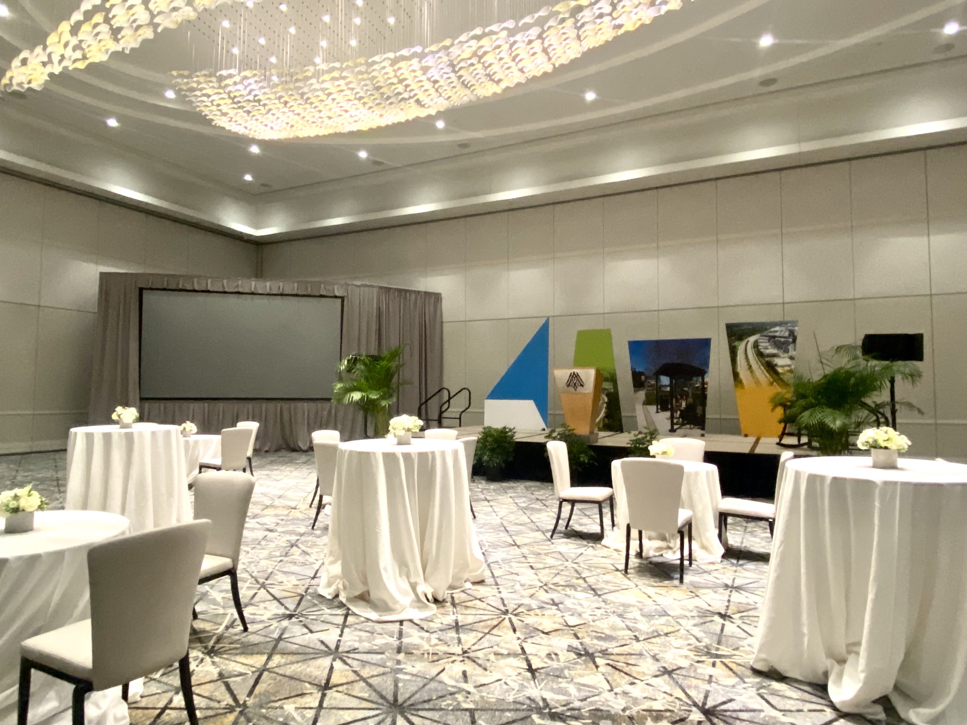
The rebrand was officially revealed at True North 400’s 20th anniversary party, which c21 also planned and executed. c21 curated giveaway items in branded boxes, with whiskey glasses that featured both the old and new logos. The brand was also incorporated into 5’-8’ ft. foamcore panels on the event stage and a photo backdrop for attendee selfies.
Organization leadership is reinvigorated and often share the compliments they receive regarding the rebrand. More importantly, analytics show there is increased engagement through email marketing, social media and the website – all pointing to a greater understanding about the CID’s efforts, impacts and community benefits.