Challenge
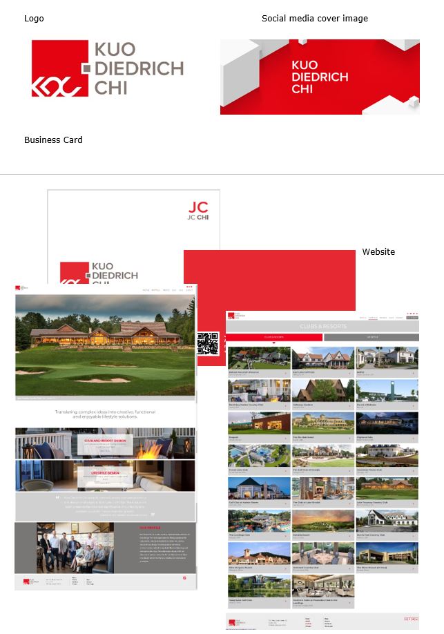
Create a new logo for Kuo Diedrich Chi Architecture – which had recently merged specialties in golf clubhouse and resort design in addition to commercial mixed-use and high-end residential design.
Solution
c21 interviewed the three principals of the newly merged firm to gather their input on the company’s name, brand image and messaging. We also interviewed current, past and lost clients to gain perspective on the company’s strengths and learn how clients perceived the principals and their work. Based on the findings, we developed a brand story and a creative brief to crowd-source the new logo/brand, which needed to represent the merged firm’s global work.
In addition to the logo design, we also secured kdcarchitects.com as their website URL, and mapped out a process to move social media platforms to the new name.
Results
We collaborated to create a modern logo with clean lines like those used in architectural designs. The logo’s principal color is red, which is internationally recognized for strength, energy and confidence and represented the primary keywords from the client interviews and our SWOT analysis.

